Tag Archives: Kerning

Font editor

sitelogoIt’s been a very long time since I’ve made an update here.  I’ve been working steadily on the font editor module for the Gorgon editor and it’s finally nearing completion (the last 99% of 99% of 99% etc…).

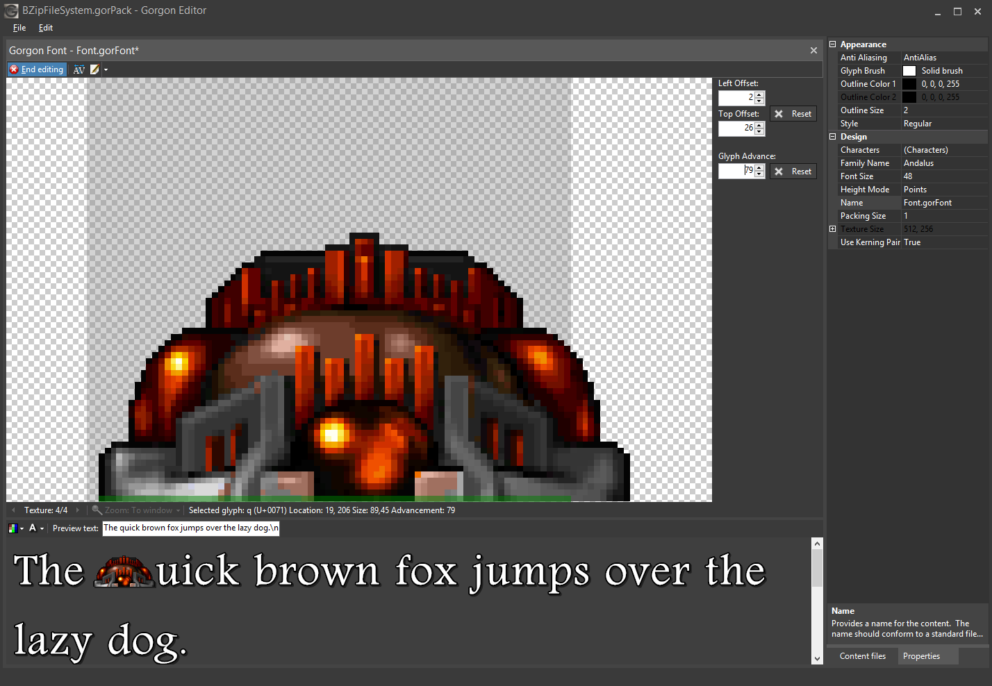
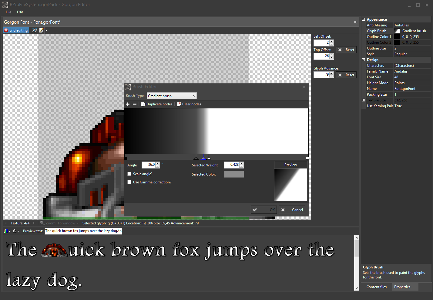
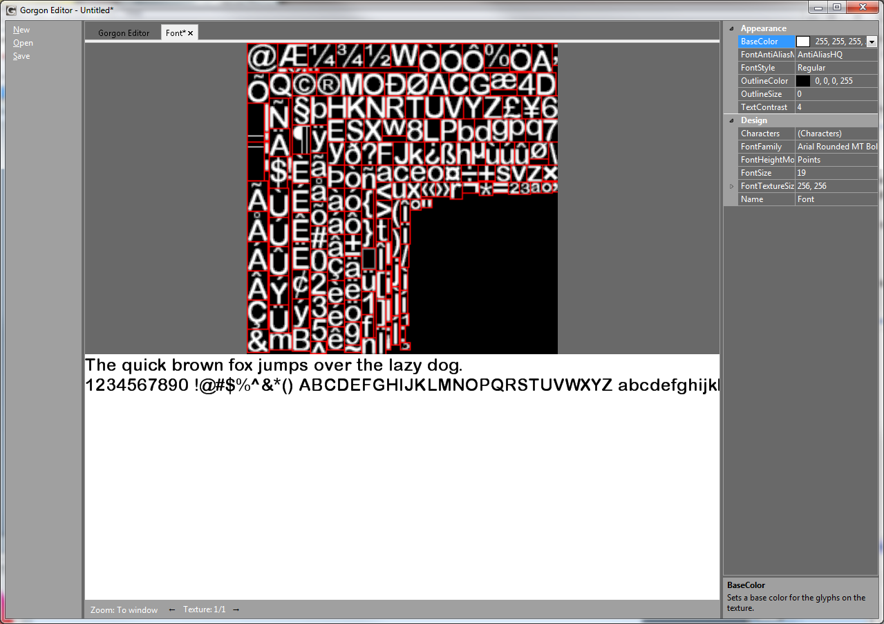
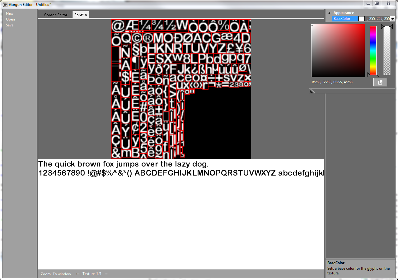
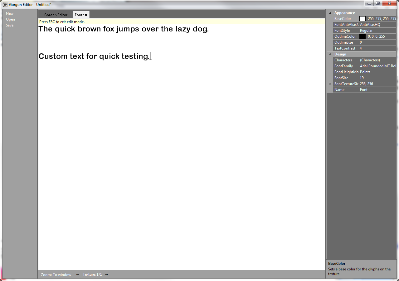
I’m quite proud of this thing.  It’s supports a pretty well rounded suite of functionality for designing a bitmap font for use with Gorgon.  Besides the usual standard stuff like font outlines, font faces, styles, etc… it also supports glyph brushes, custom glyphs, glyph advancement and offset editing and custom kerning pair tables.

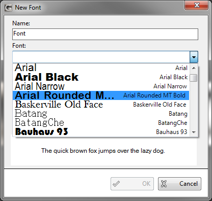
Here’s a few images:


Continue reading

Font editor

So the font editor is nearly complete.  Here’s a few screen shots:

More text stuff.

Here’s a sample of text rendering in Gorgon 2.0 (Dorian).  It’s rendering 16,019 characters, animated with shadowing (which doubles the character count), plus the FPS counter.  When it renders the text, it renders with kerning information (provided the font has any) so the output should be properly spaced.  And while it’s doing this, it’s scaling the text to pump up the fill rate.

(The video has since been deleted)

All that at ~75 FPS, that’s not too bad hey?

In this particular “demo” you can see that I’m able to compress and expand the lines of text.  This is possible because of the new “LineSpacing” property in the text object.  This allows the user to set line spacing by setting a multiplier.  For example, a LineSpacing of 2.0 will give you double spacing and 0.5 will only move the lines half way.

Anyway, I’m still plowing through all of this.  And I’m pretty happy with the results.

Text output and Fonts

Sweet merciful fuck.  That was painful.

I just spent the last 4 evenings/nights writing Gorgon’s font system and it was not fun.  And, of course, I’m still nowhere near done (still have to create the TextSprite object, and other the font effects like gradients and GDI+ image brushes).  But, I got it working.  Not only that, unlike the previous incarnation, it actually implements kerning properly (well, approximated kerning, I’m not dicking around with actual kerning.  Fuck that.)    One of the things about the 1.x font/text rendering that I absolutely hated was while it was worked, every now and again (especially on smaller fonts), it’d screw up and a letter would appear slightly (or not so slightly) shifted.  Quite annoying.   Here’s a screen shot showing how awful it was compared to GDI+ and how awesome v2 is going to be (click to expand it):

Gorgon/GDI+ text comparison

Gorgon/GDI+ text comparison

Note that all text is the same font:  Arial, 9.0 point, Bolded and Antialiased.  Also note that v2.0 is nearly (but not quite pixel perfect) identical to the GDI+ DrawString version.  I think that’s a slight improvement.

Continue reading