 Sweet merciful fuck. That was painful.
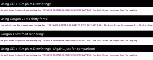
I just spent the last 4 evenings/nights writing Gorgon’s font system and it was not fun. And, of course, I’m still nowhere near done (still have to create the TextSprite object, and other the font effects like gradients and GDI+ image brushes). But, I got it working. Not only that, unlike the previous incarnation, it actually implements kerning properly (well, approximated kerning, I’m not dicking around with actual kerning. Fuck that.) One of the things about the 1.x font/text rendering that I absolutely hated was while it was worked, every now and again (especially on smaller fonts), it’d screw up and a letter would appear slightly (or not so slightly) shifted. Quite annoying. Here’s a screen shot showing how awful it was compared to GDI+ and how awesome v2 is going to be (click to expand it):
Note that all text is the same font: Arial, 9.0 point, Bolded and Antialiased. Also note that v2.0 is nearly (but not quite pixel perfect) identical to the GDI+ DrawString version. I think that’s a slight improvement.
